Fight your rivals in the multiplayer mode!
In our second Developer Diary for TransOcean 2: Rivals the Deck13 Hamburg developer team offers some deeper insights into the ideas, the basics and the technique behind the exciting multiplayer mode of the game.
Conquer new frontiers!
We are happy to present you today our first developer diary for TransOcean 2: Rivals! Game designer Andrea not only carries you off into the atmospherical Port of Hamburg, but also provides some deeper insights into the Deck13 Hamburg developer studio and the team behind the game.
Around the world in 55 harbors
Welcome to the fourth installment of our TransOcean: The Shipping Company-DevDiary! Today we would like to talk about the selection and implementation of the harbors in our game.In order to work out which harbors we would like to include, the first question was: How many? Due to the prototype harbour we had already created, we knew how long designing a complete port would approximately take – from these calculations came the decision to tackle 55 harbors.
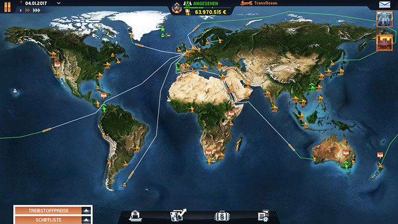
Through research we compiled a list of container ports around the globe. We deliberately excluded general cargo, ferry and passenger ports. When it came to choosing harbors from this list, we decided to make ports of well-known countries our top priority. For example, we absolutely wanted the port of New York to be part of the game. Canada should also be represented by at least one port, our home port of Hamburg needed to be included and also Rotterdam as the biggest European container port. All the other continents needed to be covered just as sensibly in this manner.
After the big and important harbors, we also wanted to include smaller but just as interesting parts of the world. This is why we also chose to include for example Honolulu on Hawaii, Anchorage in Alaska and Stanley on the Falkland Islands south of South America.
Already in the first playable version of the game, we realized that a start on the whole world map proved to be a little too overwhelming for test players and would take away from the feeling of the oceans’ vastness, which we wanted players to experience upon expanding their business later on in the game. That is why we decided to have the player start out within a smaller section of the globe - the European map.
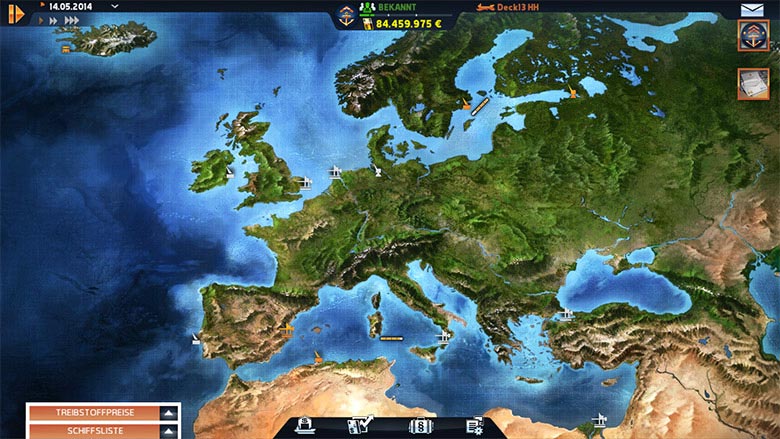
After this decision was made, the game design team started working on the layouts of the ports. We looked at the shape and location of real-life container ports on maps and emulated them in the game. We adjusted a few parameters here and there in order to, for example, shorten long distances and compress harbour areas. We wanted to remove boring gaming passages and avoid creating excessively large areas. But with the exception of these compressions, the distance you need to cover in the game until you are ready to anchor in Hamburg or Algiers or Shanghai, corresponds quite accurately with the distance you would need to cover in reality.
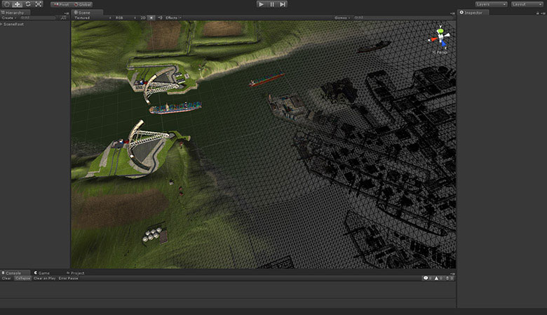
After the creation of the harbor walls, which reflect the basic shape of the port, we started placing assets, designed the surrounding areas and embellished the port space. The last step continued throughout the whole development period. And this marks the end of our developer diary series. We hope you were able to get a deeper insight into the developement of TransOcean: The Shipping Company and you cannot wait for its release.
TransOcean: The Shipping Company will be release on September 24, 2014!
Asset creation
In this third part of our developer diary we would like to tell you more about the asset creation for TransOcean: The Shipping Company.The last installment of this series ended with the team’s agreement on the look of the game and the windup of our research for all necessary objects. Now, it was time for the 2D graphic artists to start creating concept art of ships, objects and buildings, which would then in turn serve as an orientation for the work of the 3D artists.
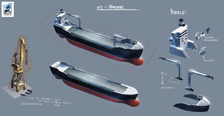
During this step, the size ratios were a special challenge for us: For one, in the 3D sequences we would always be high in the air with the camera and look down on the ports in a bird's eye view. And second: There are very few people who have actually internalized the huge dimensions of container ships, container gantry gates or single containers so that “learned” points of reference are missing. These two factors together mean that objects quickly look too small and the gigantic proportions are often not properly perceived. Were the camera on the eye level of a person standing on the ground, this would be very different.
This “shrinking effect” could be decreased step by step as we added trucks, cars and roads, as these are the objects that constitute “learned” points of reference for humans: Everyone of us instinctively knows how high a car or how broad a street approximately is or should be. This creates proportions for the not so well known objects such as gantry gates and container ships. You can observe this in the picture below:
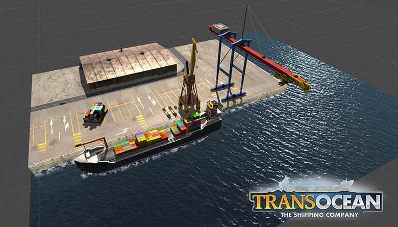
As soon as the size ratios were clear, we started building the first port prototypes: We looked at the maps of the ports and defined the maximum size of the harbors, which we wanted to implement. The last point is important because we wanted to build cities of limited size in order to keep loading times agreeable to the player. In order to save resources we also decided to limit the view in terms of range and have the player looking at the ship primarily from above.
The port prototypes were partly built with place holders, partly with the first texturized assets. During this process one thing that had to be given special importance slowly emerged: the areas close to the quay wall. While it was also important to flesh out the harbors farther inland or spreading into the city, the one thing people became consciously aware of while navigating ships into the port were the buildings and objects in immediate proximity to the quay. We therefore set a special focus on this area during the subsequent production.
How the creation of the ports as well as their selection and implementation continued will be further explained in the next part of our TransOcean: The Shipping Company developer diary.
Start of developement
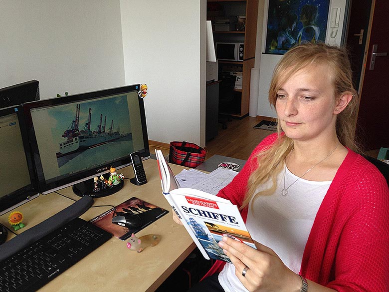
Welcome to the second developer diary of our ocean carrier tycoon game TransOcean: The Shipping Company! Today we would like to tell you some more about the beginnings of our project.After the topic was set, our first task was to take a look at all similar products: We played other managing games and ship simulators or examined pictures and videos of them. We broke into the matter of container shipping: How big are those ships? What goods do they carry and how many? How fast are container ships, what weight do they have, how much do they cost? And how is their counterpart - a container port – structured? What type of cranes and which buildings can you find there?
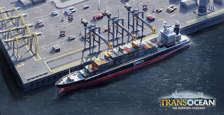
While the game design team dealt with this issue, the graphic artists took care of the game’s style: What look should our game have? Photo-realistic, abstracted realism, comic-look or something completely different? References were gathered, discussed within the team and evaluated and considered. The 2D-graphic designers created mashups for the desired mood and we finally decided to choose a modern, reduced, but realistic style, with focus on sizes and measurements of all elements in the world of shipping logistics.
Parallel to that, the programmers worked on what engine to use in our first game: Unity or DECK13’s own engine FLEDGE which had been developed by our colleagues in Frankfurt? We finally chose Unity, because it was deemed to be more flexible and more suitable for rapid-prototyping. The spatial distance to the FLEDGE-programmers in Frankfurt was also deemed a potential stumbling block, in case we needed to make changes or create additional tools. With Unity there are plenty of tools in the Unity-Asset-Store. This is how we were able to focus on the pure game development from day one - without worrying about the technology aspect.
So, we got ourselves the Unity-engine and started right away: The game design team worked on the core features that make the game challenging and rich in variety. The idea of having 3D-harbours you can use
with your ships was made certain very quickly and the graphic artists created the first assets to build up a prototype-port. And that’s what the next part of the TransOcean: The Shipping Company
developer diaries will be about.
The inspiration for TransOcean: The Shipping Company
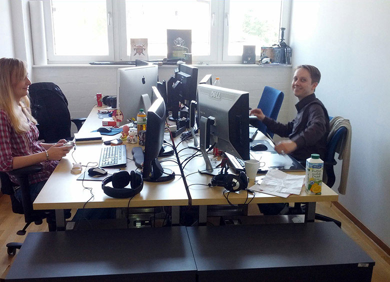
Welcome to the first part of our TransOcean: The Shipping Company developer diary series! My name is Andrea and I am working as a game designer for the developer Deck13 Hamburg. Today, we would like to outline how the idea behind the development of TransOcean: The Shipping Company came about.Deck13 Hamburg has been founded in June 2013 and started out with a small team of four people. Our parent company Deck13 in Frankfurt am Main organized an office space for us here in Hamburg as well as all the necessary equipment. We then kept visiting each other for some time in order to get everyone acquainted with their respective new colleagues.
The idea to TransOcean: The Shipping Company was born when the publisher astragon approached Deck13 with an offer to cooperate on an economic strategy game that would deal with the topic of shipping companies: Working out sea routes, accepting orders, sending container vessels all around the globe!
And who would be better equipped to develop a shipping company game than a small, fresh team situated directly in Hamburg - one of the biggest container ports worldwide and the second largest container port in Europe?
In the end, we were indeed awarded the contract and started to develop the game’s underlying concept. We felt pretty happy about this opportunity as many of our team are fans of economic strategy games themselves and grew up playing them.
Our team attracted more and more members and by late summer the group was finally complete, so that we could start to develop the game in earnest. The first step was to work out the core principles of our game: What should be our focus? Which features will offer the most variety, complexity and long-term fun to the player? Which style of graphics should we use and on which engine will the game be developed?
The answers to these questions and many more information about the first phase of development will be given in the next installment of our TransOcean: The Shipping Company developer diaries. So please stay tuned!
